|
|
|
 Joel's Blog Joel's Blog |
 Built-It Blog Built-It Blog |
 Video Roundup Video Roundup |
 Classes & Events Classes & Events |
 Work Magazine Work Magazine |
|
Hours: M-F 9:00-5:00, closed Sat,Sun Our Guarantee & Return Policy Shipping and Sales Tax Info Privacy Policy Holiday Calendar |
|
Contact Us:
Email: support@toolsforworkingwood.com Phone: 800-426-4613 or 718-499-5877 Visit Us in Brooklyn: Directions to Our Showroom © 1999-2019 toolsforworkingwood.com Powered by 01 Inc. Coded entirely in NYC |


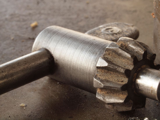
 Before I was an iron monger I did a lot of things including fine art photography. I had a few exhibits but I never sold enough to make a living at it. It was an important creative outlet for me. Most of the photography I do for TFWW is commercial and directed to show a specific product or technique. So please indulge me for a few seconds. Here is a picture I took purely because I liked the image.
Especially close up details.
One of many unsung heroes in the workshop...
Black
they eventually become a calendar or something like that?
(Forgive me if a calendar is a "cheesy-stereotype-faux pas" or
anything in the photography world... But I'd definitely buy a
calendar of interesting/thoughtful/artistic "shop shots"!)
I'd be interested in seeing it at the very least.
for some time before I read the related post. Keep 'em
coming.
I like it, years ago I started to catalog all my tools, both photographically and by a short text describing its provenance and history. By now I have a huge collections of pictures and a better idea of what I have, some of it in multiple examples hummmm how did that happened :-)
I would love it if you could give us some pointer on photographying tools, techniques, lighting, equipment used etc. In addition I find it very helpful to zoom in on a faint marking and then manipulate the contrast/brigthness, or even reversing (negative) the image to help deciphering the markings.
The macro aspect of picture taking is indeed very useful to me, and im sure we could all benefit from your expertise
Cheers
Bob
but felt a need to pursue my major. Enjoy shots like this.
Design is presenting something ordinary in an extraordinary way, art is
something else...but pictures first please.
it's a striking shot of such a mundane tool. Shots of infill
planes are always gorgeous, but there's beauty in the the
ordinary, as well.
This is the antithesis of the high end hand plane, polished and "casually" placed along side a prepared piece of wood with five shavings carefully staged in the shot.
I would love to see more.
more pics please and tips for better lighting etc.
Steve
A couple of points that to my eye might improve this particular image, constructive criticism only intended. First of all, I love the grit in the teeth and the small bits of chips. It appears maybe slightly too cropped. The tip being cropped out is somewhat disturbing to me. Likewise the metal shaving almost in view, seems to draw my interest, but can't quite see, same thing with the "not sure what it is" in the top right.
More please.
photos of this type, we expect more in the near future :)